Ai Cinematic Video Ads | Aim8
Ai Cinematic Video Ads | Aim8
Ai Cinematic Video Ads | Aim8
Introduction
Introduction
In this commercial case study, I worked with an AI startup in the customer service sector to create a brand image ad. The company provides full data analytics, call center operator support, and AI agents capable of answering calls.
In this commercial case study, I worked with an AI startup in the customer service sector to create a brand image ad. The company provides full data analytics, call center operator support, and AI agents capable of answering calls.
Introduction
In this commercial case study, I worked with an AI startup in the customer service sector to create a brand image ad. The company provides full data analytics, call center operator support, and AI agents capable of answering calls.
Expertise & Soft
Expertise & Soft
In this comprehensive project i am used Design and Ai Video Knowledges, Used Soft - After Effects, Premiere Pro, Photoshop, Notion, Runway Gen3, Midjourney.
In this comprehensive project i am used Design and Ai Video Knowledges, Used Soft - After Effects, Premiere Pro, Photoshop, Notion, Runway Gen3, Midjourney.
Expertise & Soft
In this comprehensive project i am used Design and Ai Video Knowledges, Used Soft - After Effects, Premiere Pro, Photoshop, Notion, Runway Gen3, Midjourney.
Request
Request
The core problem that Aim8's AI agents solve is the excessive workload of human call center operators and the lengthy data analysis processes. In this case, AI agents can assist by providing advice to human operators and, in some instances, even answering calls themselves.
The core problem that Aim8's AI agents solve is the excessive workload of human call center operators and the lengthy data analysis processes. In this case, AI agents can assist by providing advice to human operators and, in some instances, even answering calls themselves.
Request
The core problem that Aim8's AI agents solve is the excessive workload of human call center operators and the lengthy data analysis processes. In this case, AI agents can assist by providing advice to human operators and, in some instances, even answering calls themselves.


Approach
Approach
Since this is a young startup, I decided to create a brand-building ad that grabs attention, as the client's main social network is LinkedIn.
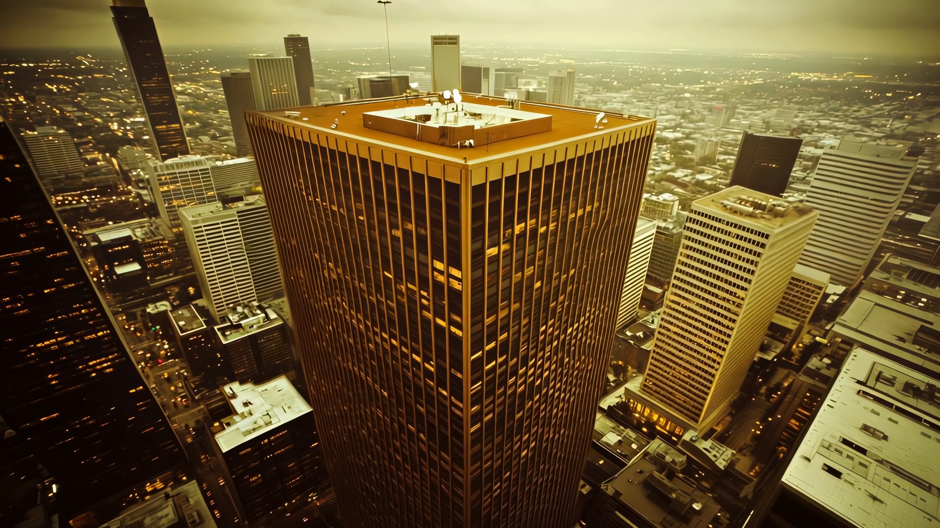
The concept is based on two contrasting worlds: one before the introduction of new technologies and the future, which is already here. The challenge was to create a unified video that doesn't feel like two separate parts. I set the structure and started working on the project.
Approach
Since this is a young startup, I decided to create a brand-building ad that grabs attention, as the client's main social network is LinkedIn.
The concept is based on two contrasting worlds: one before the introduction of new technologies and the future, which is already here. The challenge was to create a unified video that doesn't feel like two separate parts. I set the structure and started working on the project.


Process
Process
Project Timeline
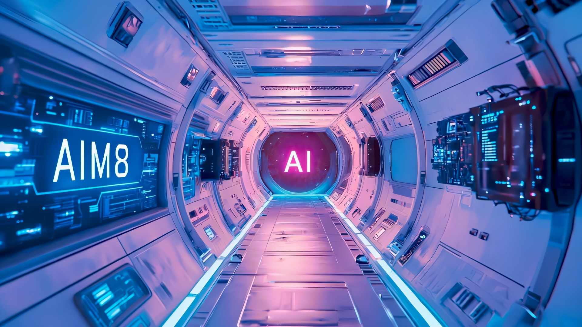
I developed several concepts, tested them within AI limitations, and chose the one we thought was best: a futuristic orbital station with AI agents orbiting Earth.
Since I wanted to use contrasts, I had to work them into many layers of the ad, maintaining a moderate pace in terms of perception and event development.
The layers of contrast, based on duality, included:
- Worlds: old vs. new
- Times: 1990s USA vs. the near future (within 100 years)
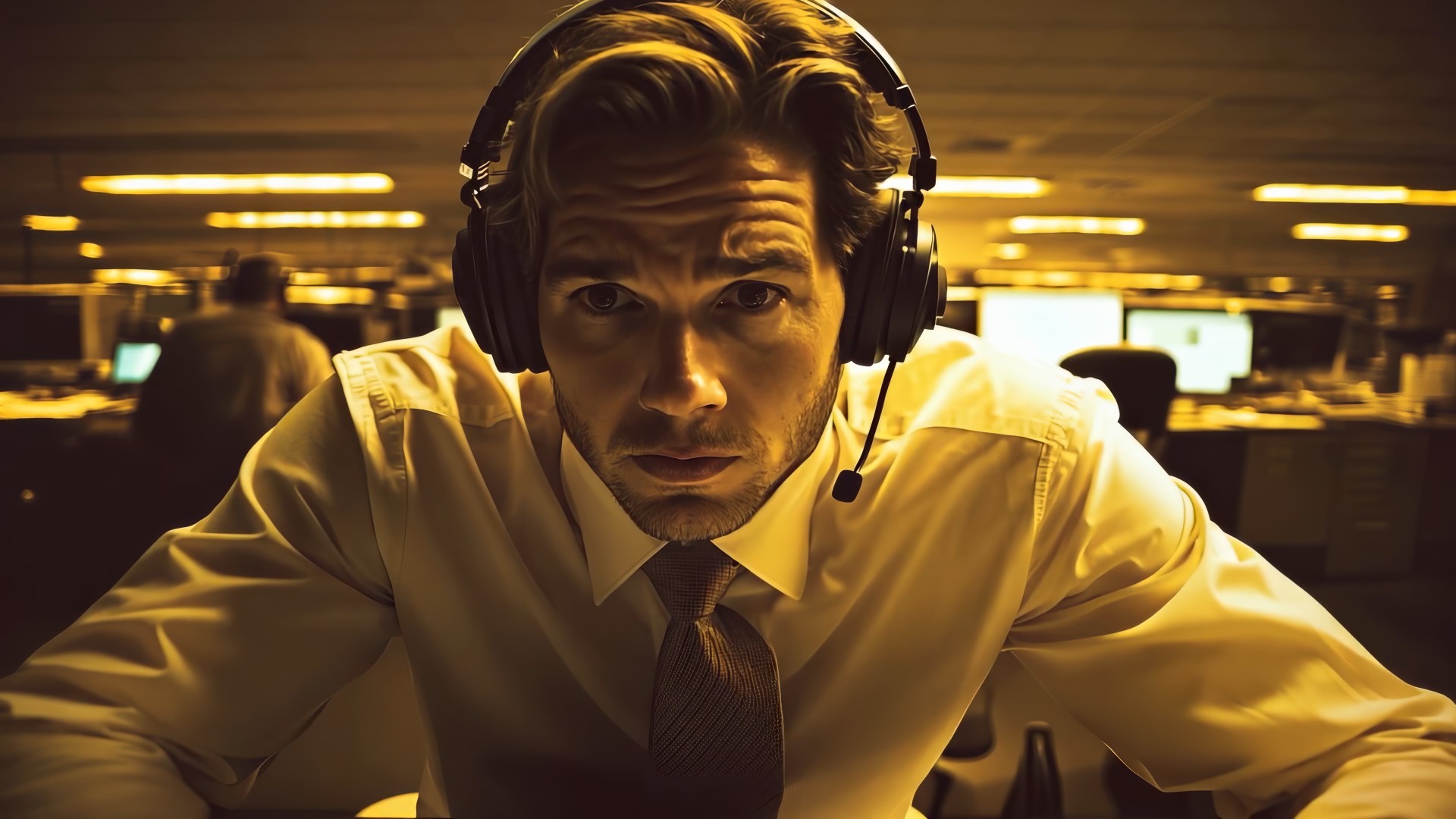
- Characters: a human operator vs. an AI agent
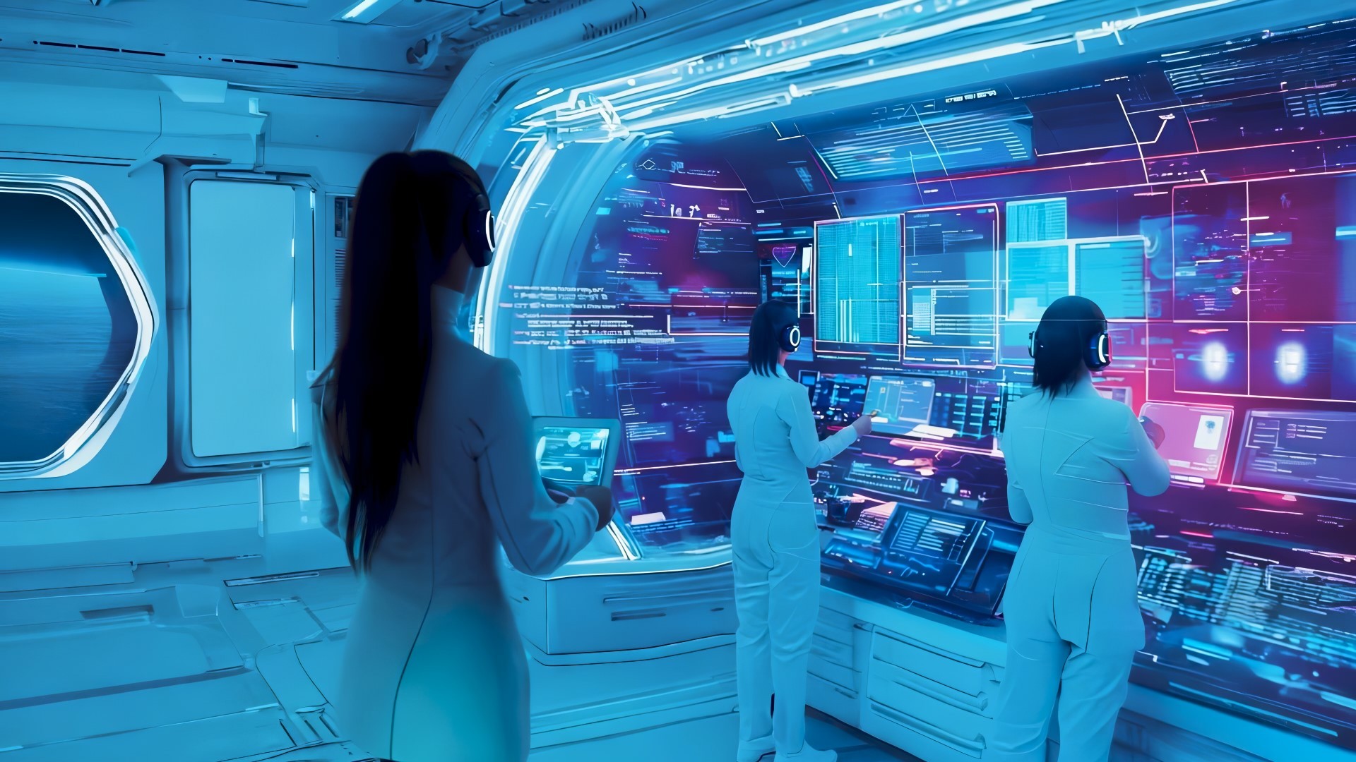
- Gender: male vs. female
- Colors: brand colors vs. their opposites
- Sizes: a large, cramped skyscraper office vs. the vastness of space and a small orbital station
- Emotions: tension vs. calm
To make the video feel unified, I used a transitional color and carefully crafted the transition between the two worlds, ensuring both logical and technical consistency —through colors, speed, and complementary compositions, among other elements.
In each part of the video, I worked to increase the contrast. In the first half, we build up to the peak of the operator's stress. The story shows a tired operator talking to a client who didn’t get the help they needed. It’s an emotional monologue, but the operator doesn’t respond, too exhausted to handle the pressure anymore.
All of this happens with growing background sounds—ringing phones, office equipment, clicking lights, and electric noises. This makes the second half of the video feel more relaxing for the viewer. That’s the power of contrast. In the second half of the video, we travel a great distance to an orbital station, a data center managed by AI agents, with a voiceover from an expert explaining everything. It draws a parallel to the same situation as in the call center, but here everything is under control and running smoothly. This is confirmed by a similar phone call, where the same client thanks the support agent for their help.
The video ends with clean colors, soft sounds, and the brand's logo, inviting viewers to learn more on the website, completing the ad structure.
Process
Project Timeline
I developed several concepts, tested them within AI limitations, and chose the one we thought was best: a futuristic orbital station with AI agents orbiting Earth.
Since I wanted to use contrasts, I had to work them into many layers of the ad, maintaining a moderate pace in terms of perception and event development.
The layers of contrast, based on duality, included:
- Worlds: old vs. new
- Times: 1990s USA vs. the near future (within 100 years)
- Characters: a human operator vs. an AI agent
- Gender: male vs. female
- Colors: brand colors vs. their opposites
- Sizes: a large, cramped skyscraper office vs. the vastness of space and a small orbital station
- Emotions: tension vs. calm
To make the video feel unified, I used a transitional color and carefully crafted the transition between the two worlds, ensuring both logical and technical consistency —through colors, speed, and complementary compositions, among other elements.
In each part of the video, I worked to increase the contrast. In the first half, we build up to the peak of the operator's stress. The story shows a tired operator talking to a client who didn’t get the help they needed. It’s an emotional monologue, but the operator doesn’t respond, too exhausted to handle the pressure anymore.
All of this happens with growing background sounds—ringing phones, office equipment, clicking lights, and electric noises. This makes the second half of the video feel more relaxing for the viewer. That’s the power of contrast. In the second half of the video, we travel a great distance to an orbital station, a data center managed by AI agents, with a voiceover from an expert explaining everything. It draws a parallel to the same situation as in the call center, but here everything is under control and running smoothly. This is confirmed by a similar phone call, where the same client thanks the support agent for their help.
The video ends with clean colors, soft sounds, and the brand's logo, inviting viewers to learn more on the website, completing the ad structure.


Result
Result
The results of the work fully satisfied both me and the client. The video turned out cohesive and emotional, while also being restrained and cinematic. With the right approach, AI is already capable of handling new tasks and pushing the boundaries of what's possible.
The project was completed in 60 hours (2 weeks)
Result
The results of the work fully satisfied both me and the client. The video turned out cohesive and emotional, while also being restrained and cinematic. With the right approach, AI is already capable of handling new tasks and pushing the boundaries of what's possible.
The project was completed in 60 hours (2 weeks)


Portfolio
Portfolio
Portfolio
Portfolio
GO BACK TO SERVICE
©2024 DIGITAL WINDS DESIGN
GO BACK TO SERVICE
©2024 DIGITAL WINDS DESIGN
GO BACK TO Service
©2024 DIGITAL WINDS DESIGN
GO BACK TO SERVICE
©2024 DIGITAL WINDS DESIGN